People not pills
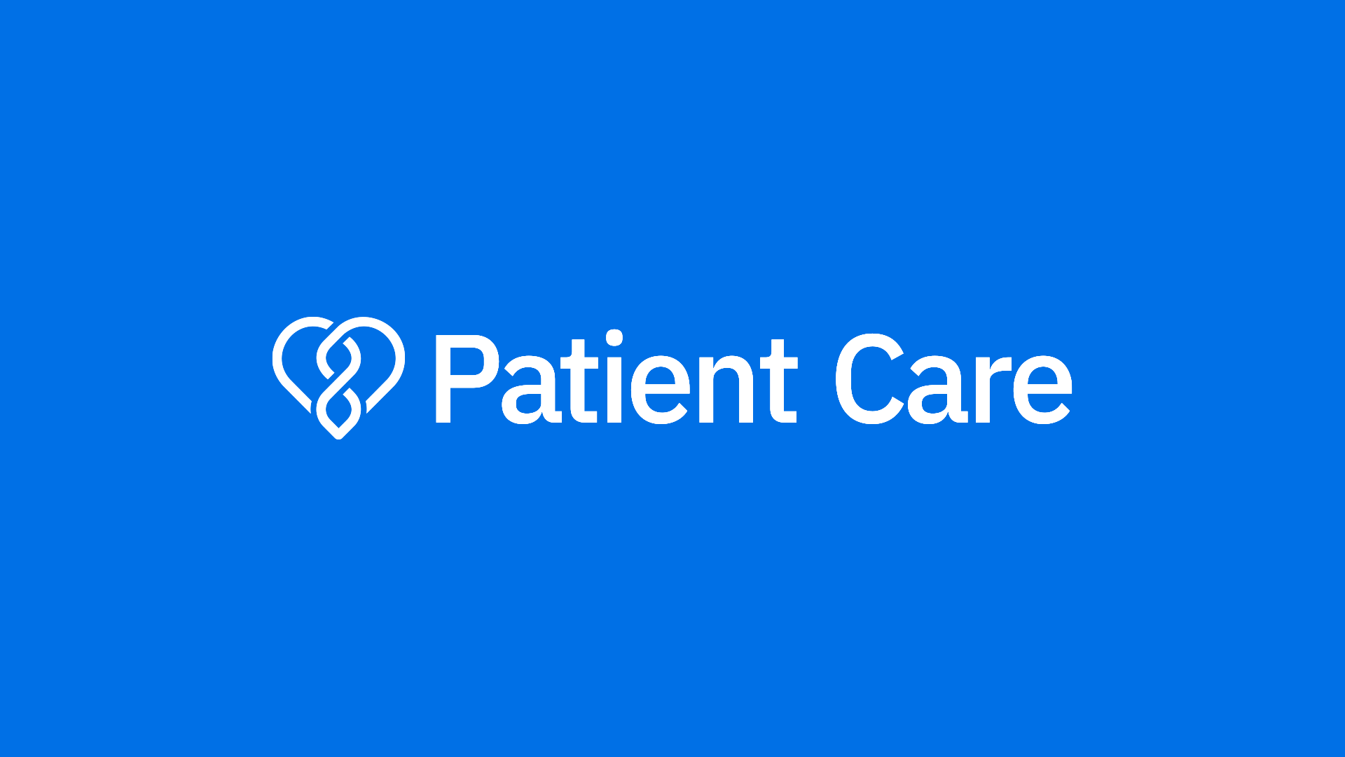
This new identity was to be used with the patient care team in mind. The visual branding will be used across platforms such as comms, decks, merch, and Slack. The goal was to create something to bond a newly born team together whilst provoking joy and passion.
-
LloydsDirect - McKesson
-
Project Lead and Visual direction
-
3 weeks of work
Problem
Due to the Pandemic, the Customer Experience Team faced a large restructuring. We decided to give the team its own brand identity.
Solution
We created a symbol and a wordmark to make up our logo. We use the same typography used in the Echo logo and have given the symbol a similar feel to the Ouroboros, so it feels part of the same family. We used blue as the primary colour It evokes trust.
Learning
This rebranding gives a fresh face to the Patient Care Team. It allows its members to feel empowered and ownership over the brand. Building a brand based on the opinions of the team was key. Everyone is excited to wear the new merchandise, uplifting team morale.


