Nationwide Print
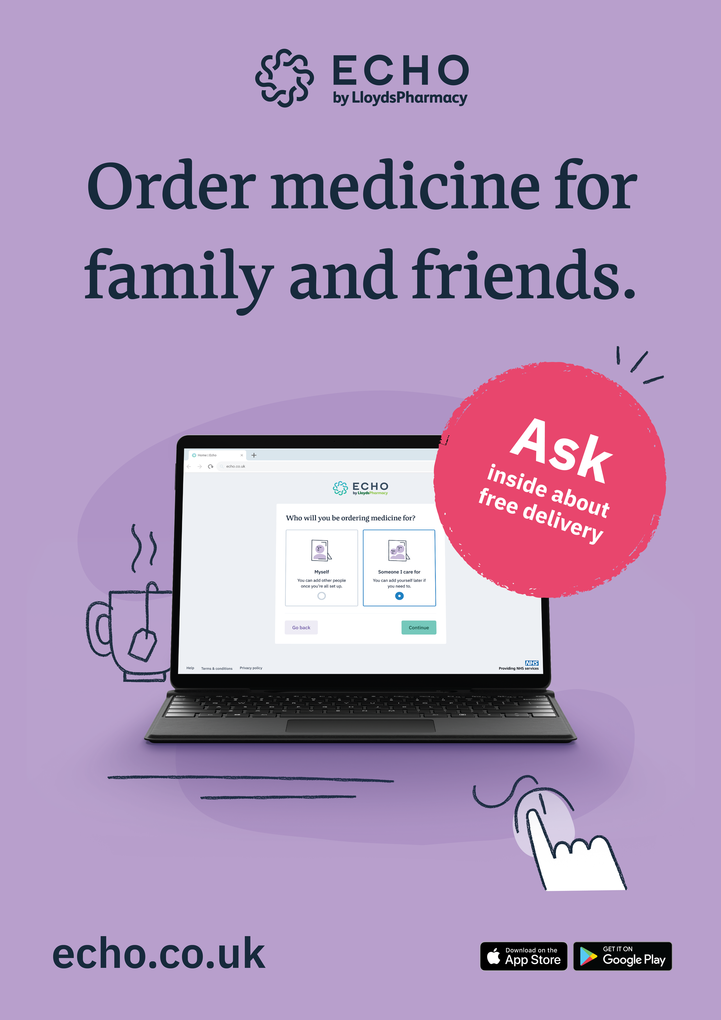
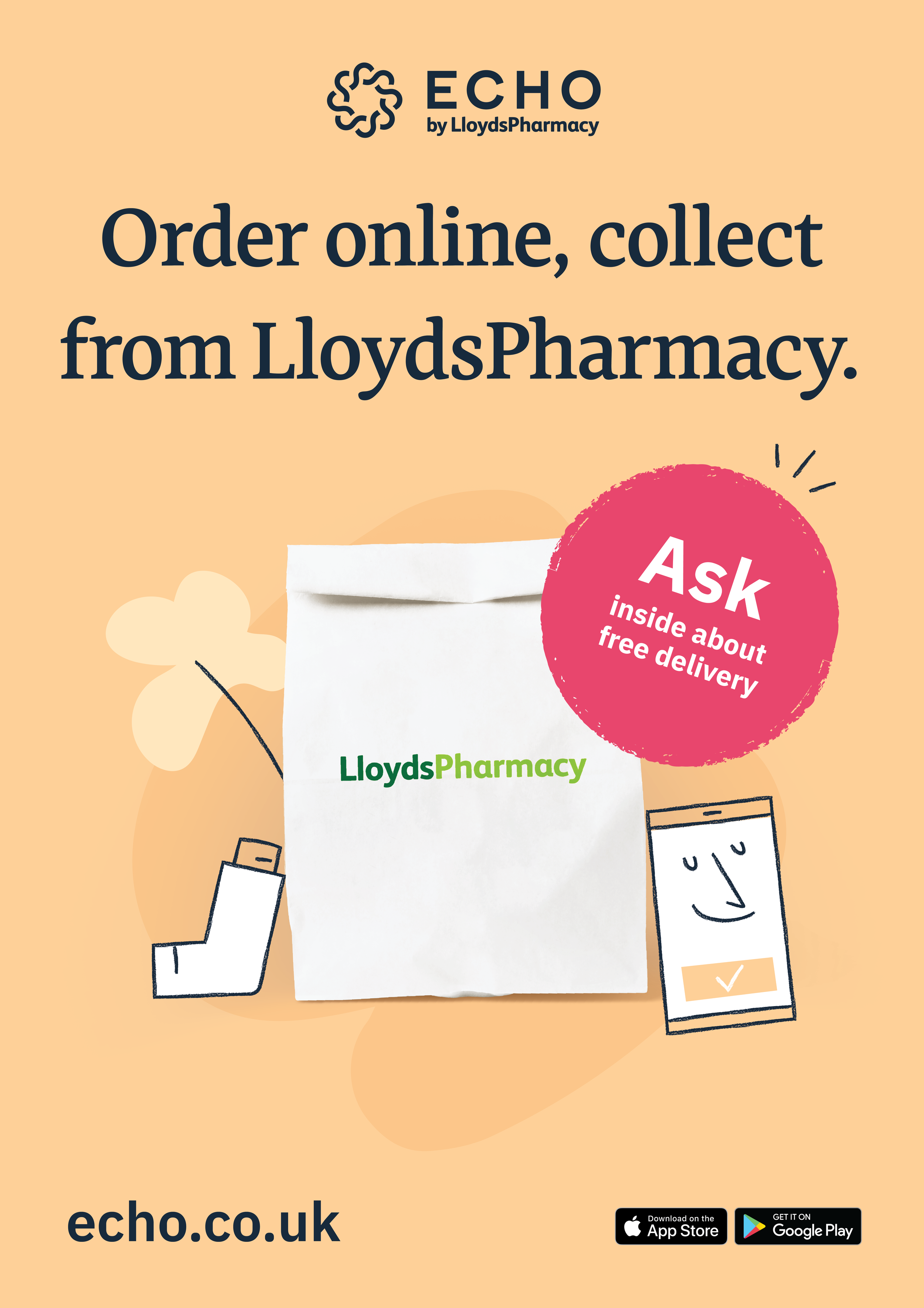
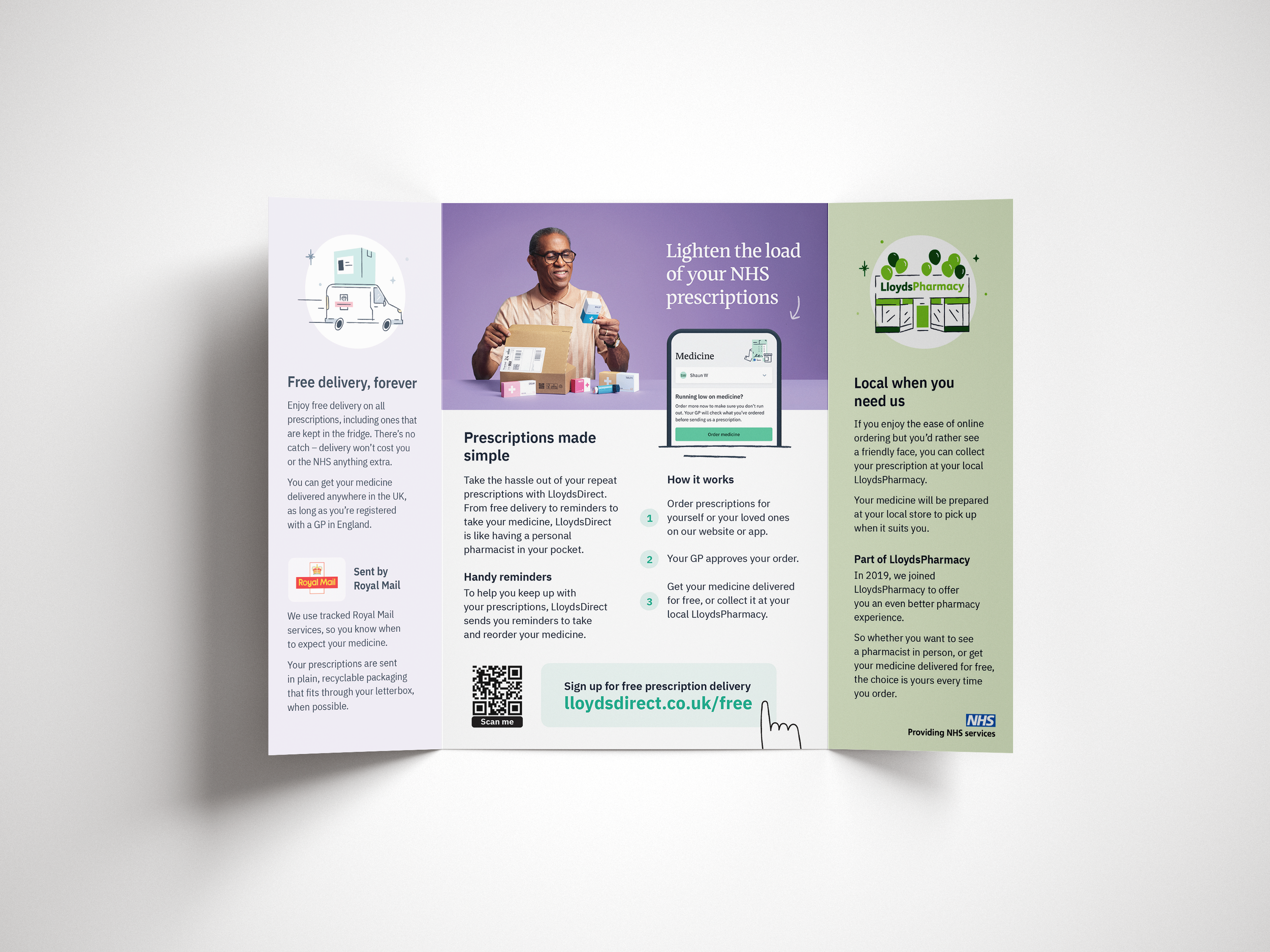
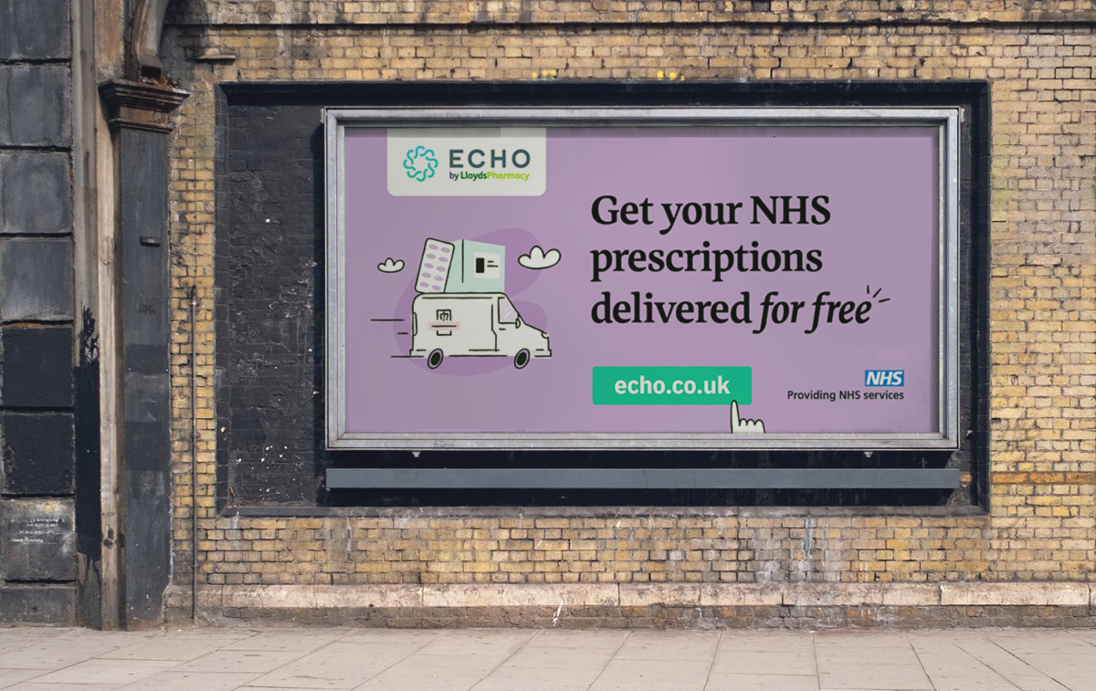
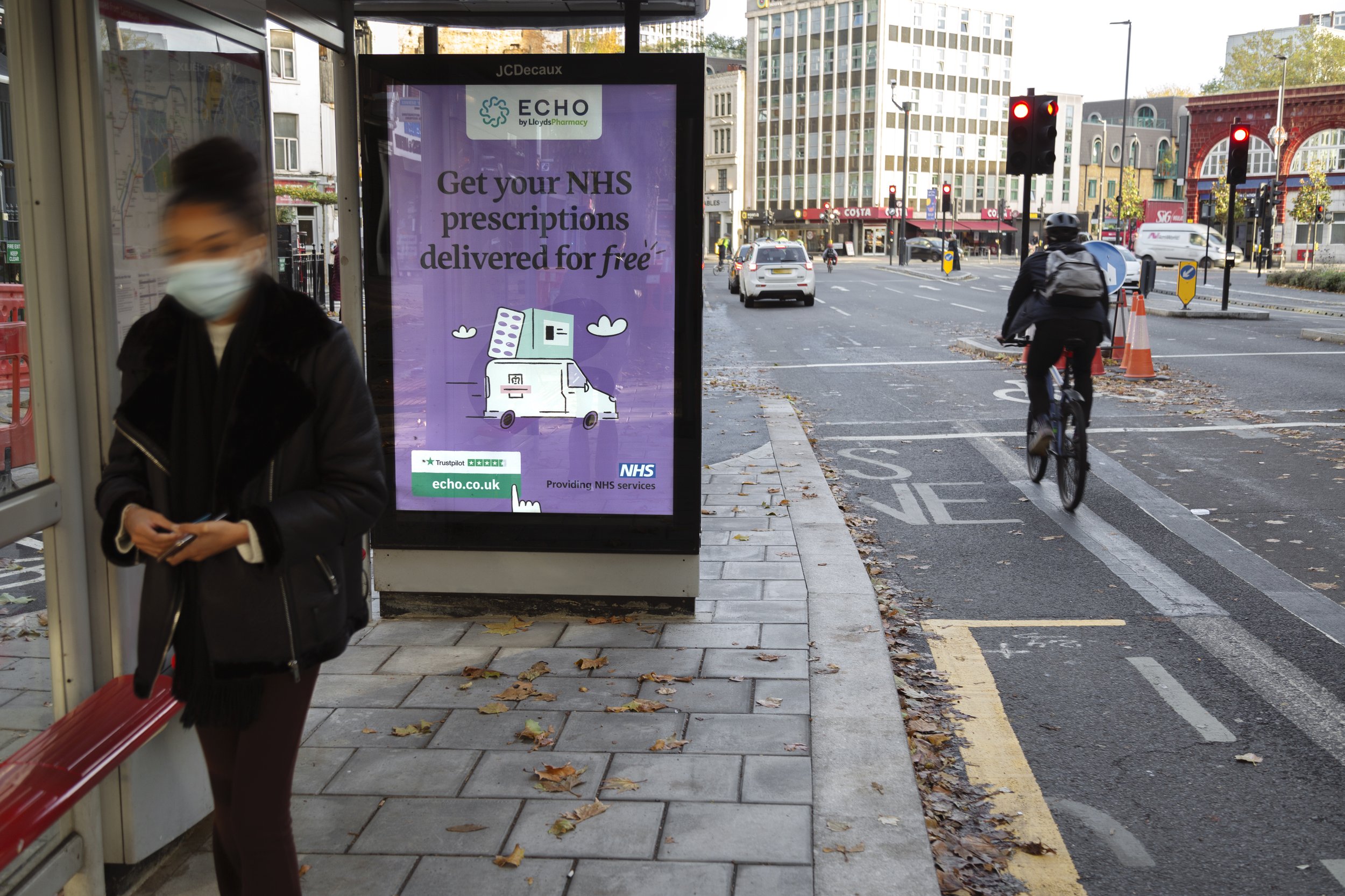
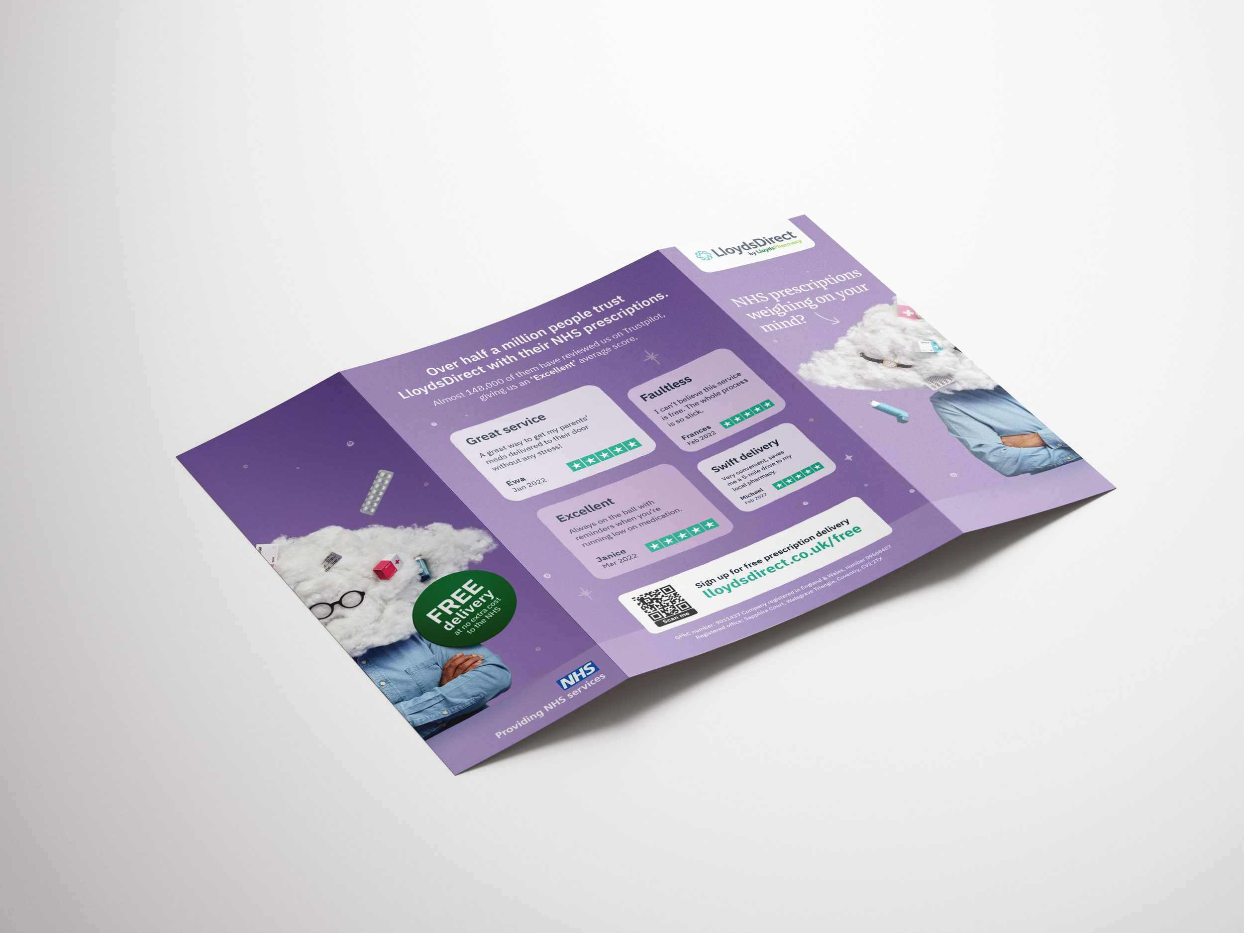
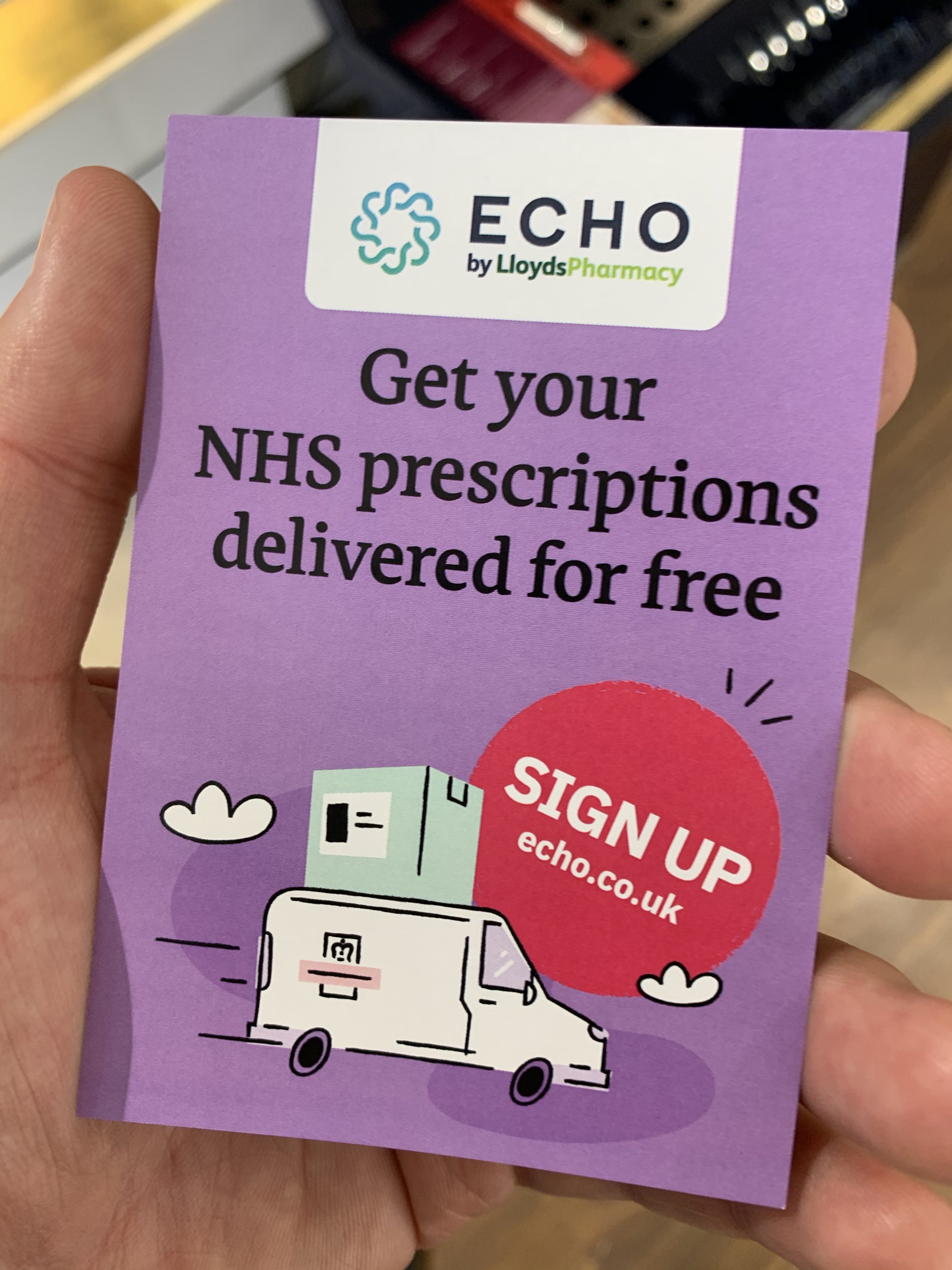
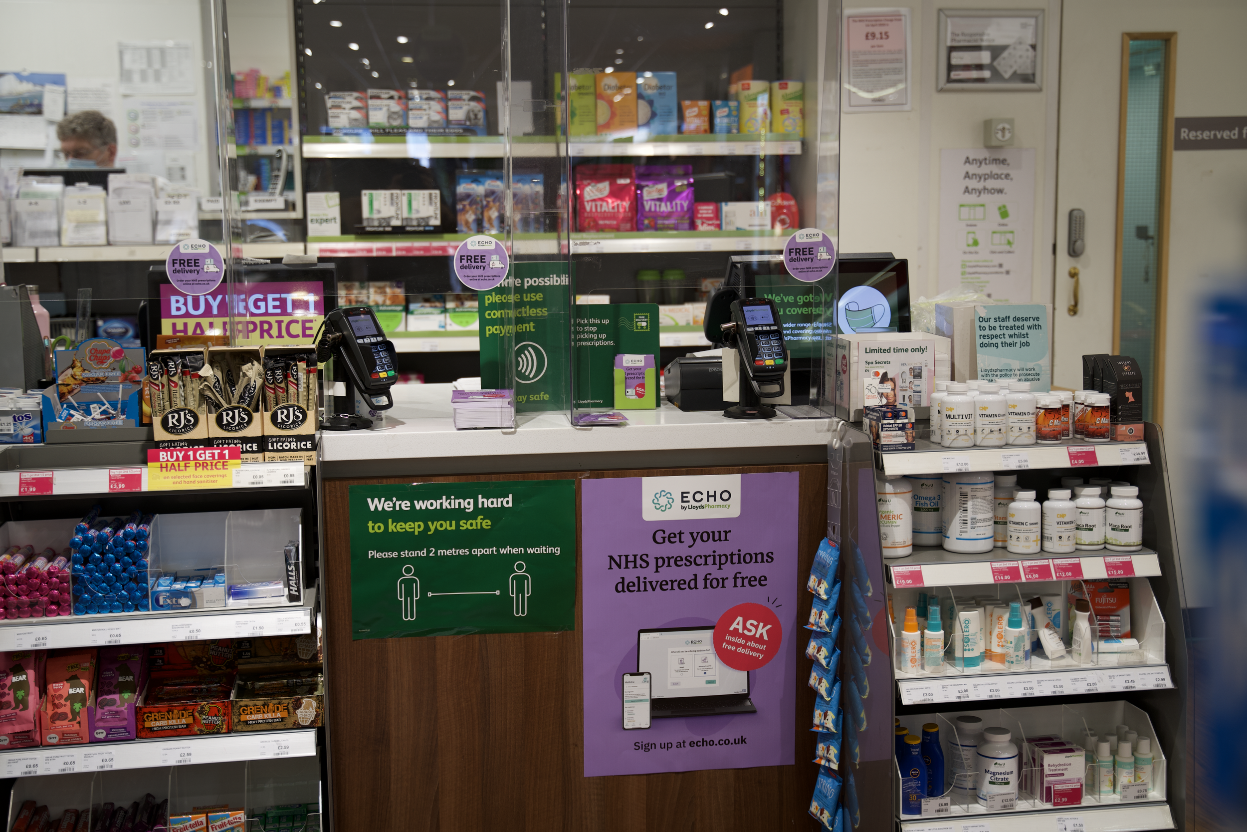
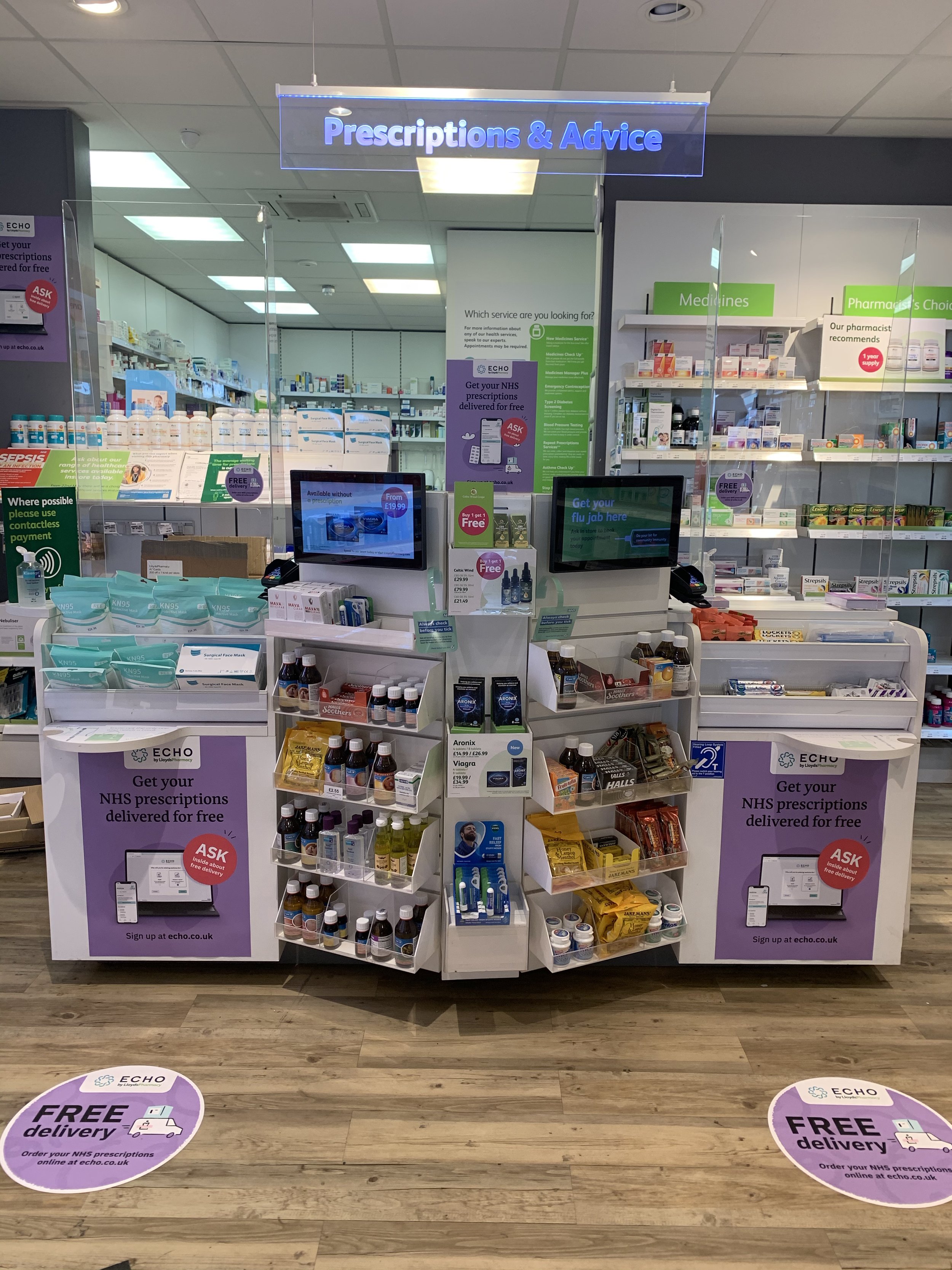
I’ve been working across many static marketing formats, from more traditional direct mails to extravagant cutout formats to OOH posters and LloydsPharmacy country store takeover. The overarching goal is to spark curiosity in the viewers and ensure the message is always clear.
-
MVF, LloydsDirect
-
Project Lead and Art direction + execution
-
2 weeks on estimate
Problem
Static formats often have limited space available. From a design point of view, the challenge is always to make the layout clear. The call to action is also a key part in what we need to make the design stand out.
Solution
Clean and simple layouts are the key alongside consistency with the brand’s tone. For the store takeover using a consistent colour background ensure we stood out against competitors. When it comes to OOH, the challenge was communicating effectively our service by using imagery.
Learning
From marketing channels, I have learned a lot of things. My two biggest takeaways are the ability to stand out against competitors and provide consistency. By doing these campaigns we have started to create brand components that we’ve brought into the wider branding. For example, the purple background and the hero visual layout.
Sneak peek into my way of working
Here is an excellent example of how I like to map out a new project, this enables better collaboration, great team alignment and overall strong visibility.

